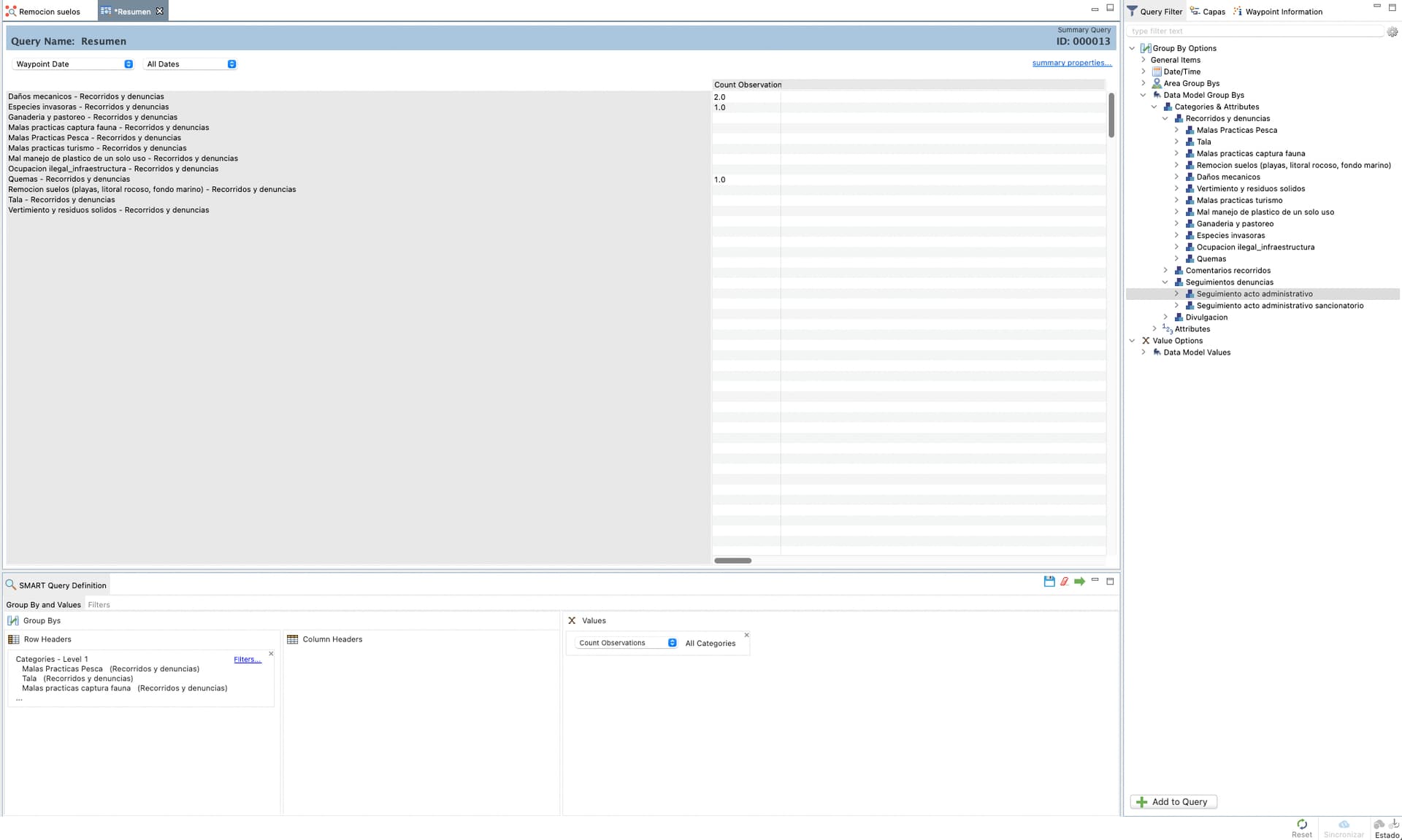
Hi all, is it possible to edit the x-axis names of a bar-chart? The query is pulling out the name of the category that has inside the other categories and the name is too long (please see screen shot).
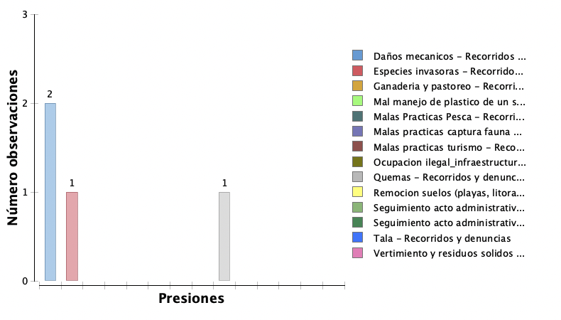
So, when I create the chart, the names don´t appear complete.
Hi Lina,
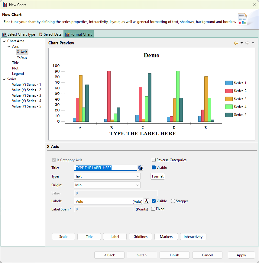
Yes, in the chart editor.
To label the axis:
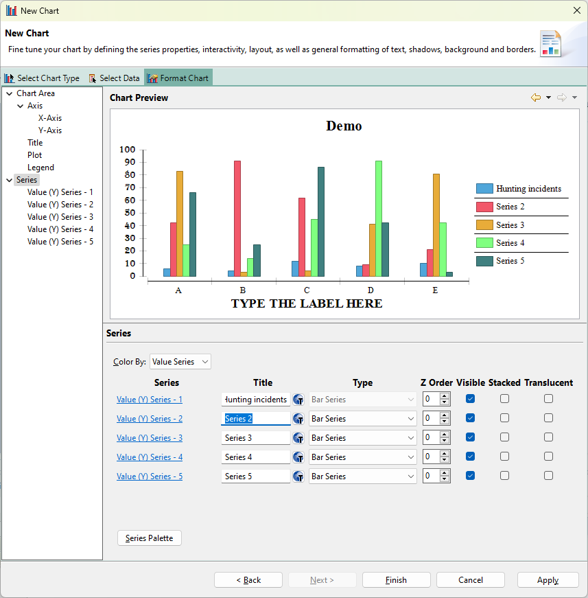
To edit the series:
Kind regards,
Alex
Hi Lina
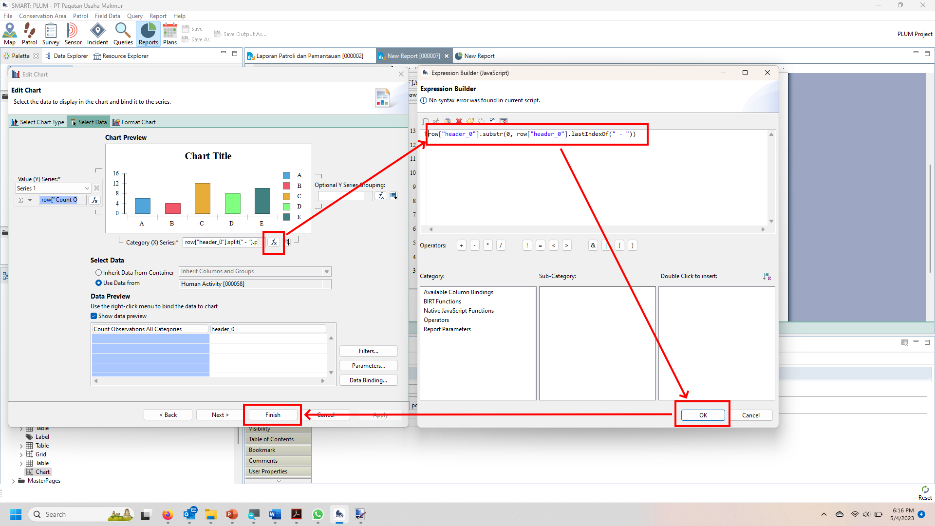
To reduce the long name, you can use a little script like this
row[“header_0”].substr(0, row[“header_0”].lastIndexOf(" - "))
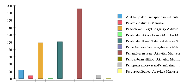
Before using script
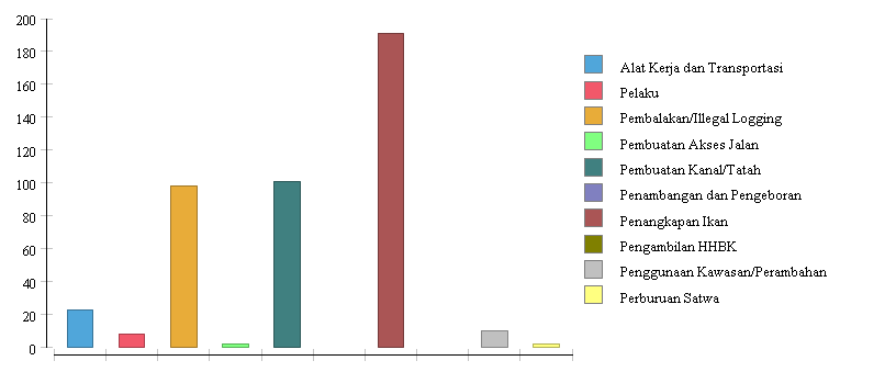
After using script
Regard
Lili Sadikin